· 3 min read
Thumbs Up and Thumbs Down Are More Complicated Than They Look
Two little icons under every answer. It sounded like an afternoon of work. It turned into a lesson in how many ways a simple feature can go wrong.
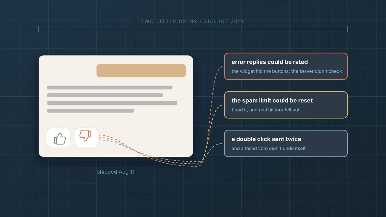
Two little icons under every answer. How hard could that be?
At the end of the last post, I was still the one deciding which answers were bad. I read through conversations, picked out the problems and turned them into tests. But the people actually using the website agent knew better than I did whether an answer helped them. They just had no way to tell me.
So I added thumbs up and thumbs down.
It looks like two buttons
From the outside, that's all it is. Two icons under an answer. Click one, it lights up, done.
Underneath, there's a surprising amount going on. Every answer needs a stable ID, so a vote lands on the right message. The vote has to be saved. Not every reply should be rateable. Someone shouldn't be able to vote a thousand times. The button has to show that something's happening while the vote is being saved, and undo itself if saving fails. And the votes have to show up in the admin, or they're not much use to anyone.
Then there's the one that mattered most to me. A thumbs down is an opinion, not a fact. Feedback should help me find answers to look at. It should never quietly turn into something the agent answers from.
I shipped it on August 11. Three real problems showed up almost right away.
Error replies could be rated
Sometimes a reply isn't really an answer. Something went wrong, and the customer gets a message saying so. There's nothing to rate there, so the website agent never showed thumbs on those replies.
But hiding the buttons in the widget isn't the same as not allowing a vote. If someone sent the request straight to the server, skipping the widget entirely, the server would happily accept a rating on an error message.
The widget was doing the right thing. The server wasn't checking. Those are two different things, and only one of them actually protects you.
The spam limit had two holes
I'd added a limit so nobody could flood the system with votes. To do that, it kept track of who had already voted.
The first hole was simple. That memory could grow without any limit at all. Given enough traffic, it would just keep getting bigger.
The second one was sneakier. When the memory got full, it made room by dropping the oldest entries. That sounds reasonable until you think about it from the other side. Someone could flood it with a pile of throwaway conversation IDs, push a real conversation out of its memory and reset that conversation's limit. Then vote again.
The fix, on August 12, was to flip the behavior around. When the memory is full, it turns away new entries instead of forgetting old ones. Nobody gets to erase their own history by making noise.
The double click
The last one was a classic.
A fast double click could send the same vote twice. And if a vote failed to save, the button didn't go back to what it showed before. It looked like your vote had counted when it hadn't.
Neither of those is dramatic. But a feedback button that sometimes counts twice, and sometimes shows a vote that never happened, isn't giving you feedback you can trust.
A simple feature isn't simple if it has to be right every time.
Why it mattered
None of these problems were about AI. They were ordinary software problems. I'd have run into the same things building feedback buttons on any website.
That was the lesson, really. The more the website agent grew, the less of the work was about the model, and the more of it was about all the ordinary pieces around it doing exactly what they should. Two icons turned into server checks, limits, cleanup and careful state handling.
The next problem
Now feedback was coming in. Conversations were being saved. Knowledge Gaps were piling up. Tests were growing.
All of it was useful. And all of it was scattered. I needed one place where I could follow a conversation from start to finish and see everything that happened along the way.